
 Bridgepointe Tech Partner to Accelerate Adoption of Amelia 7 and Autonomics")


I had to check the weather forecast, but there was a problem. My screen was a mess.
A ticker machine gave me titles I didn’t ask for. A to-do list widget showed me tasks I’d been ignoring, carefully listed, waiting to shame me again. A social media widget displayed major updates as if FOMO needed a cheerleader.
I didn’t even find the weather widget I was looking for. The very thing I had once bragged about, the reason I had carried the Android flag for over a decade, had backfired on me.
Personalization had quietly, slowly, and completely taken over my phone, turning it into a prison of my own design.
It was time to redesign my home screen around what really mattered, without the noise.
I still remember my first Android phone and how exciting it was to make it my own. While my friends were stuck with the same rigid rows of icons, I could move, shape, and modify everything.
At the time, nothing captured the charm of Android better than HTC. The company was at its creative peak, making some of the coolest phones on the market.
On the software side, the HTC Sense flip clock and weather widget. It was the look of the time.
This massive block of skeuomorphic design, inverted numbers, and tiny weather animations were a status symbol.
It was a time when just a glance meant something authentic, long before companies turned the phrase into marketing jargon.
Widgets were rare, but these early widgets were genuinely useful. Then came the quiet takeover.
Each developer decided their app needed it too. That’s when the mess started.
When every app demanded a piece of my home screen
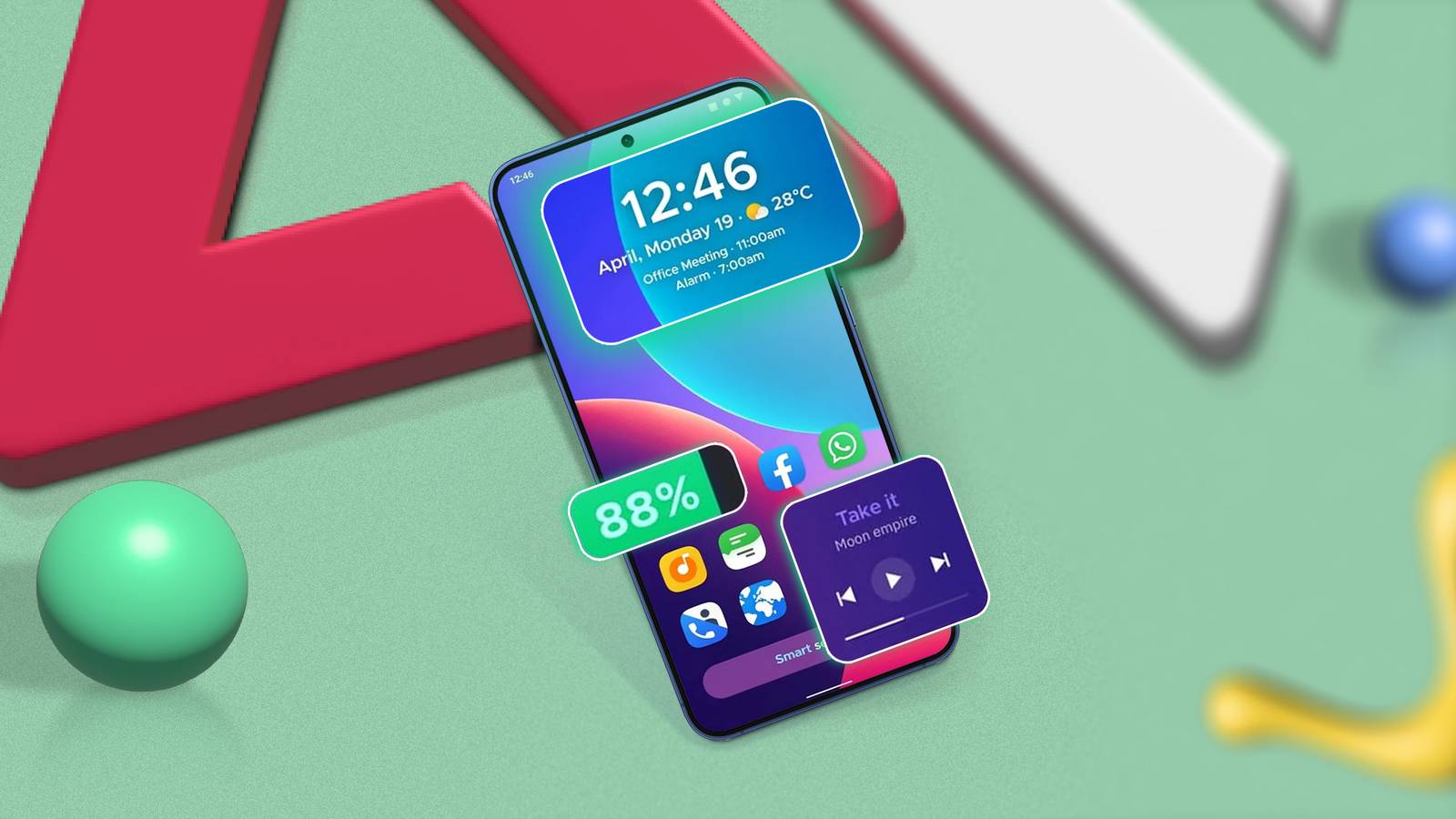
Fast forward a decade and my home screen looked less like Times Square. Every app, from my bank to my favorite fast food restaurant, now has a widget.
And in my enthusiasm to create the perfect dashboard, I used them all.
Every time I unlocked my phone, I forced my brain to process a dozen distracting items.
When I finally audited the mess, my bad widgets all fell into three distinct categories.
Anxiety Widgets
The worst offenders are what I call anxiety widgets. They are not there to inform you but to keep you engaged.
They stream a flood of high-volume, low-priority data designed to grab your attention.
Take the Facebook Top Updates widget, for example. This is a live window on your feed with posts, photos, and news from friends.
And the X widget (formerly Twitter) follows the same model, embedding an infinite timeline right on your home screen.
Redundant widgets
They’re relics from a time when we were all obsessed with what was happening under the hood of our phones.
Think about battery graphs, CPU monitors, and network speed indicators taking up valuable screen space. My status bar already shows me the battery percentage. I don’t need a 2×2 chart showing his discharge curve over the last six hours.
It’s data for data’s sake, the digital equivalent of mounting your car’s oil pressure gauge front and center on the dashboard.
Portal widgets
Finally, there are the portal widgets. They are the most disappointing of the group. These are oversized buttons that pretend to be useful.
A portal widget does nothing other than open the application it represents without any real information.
The day I cleaned my home screen
I held my finger down on my home screen, found the delete page button, and cleared every widget and shortcut. All five pages. I was left with a single blank screen. It was terrifying and beautiful.
Then I started rebuilding, but not before establishing a new philosophy. For a widget to earn a place on my new screen, it must follow three rules.
The 3 second rule
Can I get 100% of the information I need from this widget in 3 seconds? If I have to scroll or read a paragraph it fails.
A simple weather forecast (Temp: 68°, clear) passes. A drop-down list of news headlines fails.
The pull-only rule
Does the widget pull data that I, the user, personally created or requested (e.g. “my calendar”, “my shopping list”, “my next task”)?
Or is this transmitting me annoying, algorithmically chosen data? My home screen is now a fetch only area.
Function over form
The widget must be functional first and beautiful second. This was the hardest rule for the nostalgia demon in me.
I love the aesthetic of classic Android skins. Remember the HTC Sense clock? It’s a huge 4×2 block.
A simple 4×1 text widget gives me the same information in half the space.
The minimalist setup that made my phone useful again
Unlocking my phone doesn’t feel like a chore or an attack on my senses. The widgets that survived the purge are all productivity widgets that I can’t live without.
The Gmail widget? Disappeared. My inbox is a to-do list, not a home screen decoration. News and social media widgets? Deleted. My phone is a tool, not an anxiety ticker.
I found the balance. The nostalgic spirit of personalization – the desire to make my phone truly mine – is still there. But it’s now balanced with minimalism.


