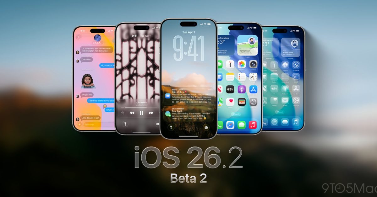
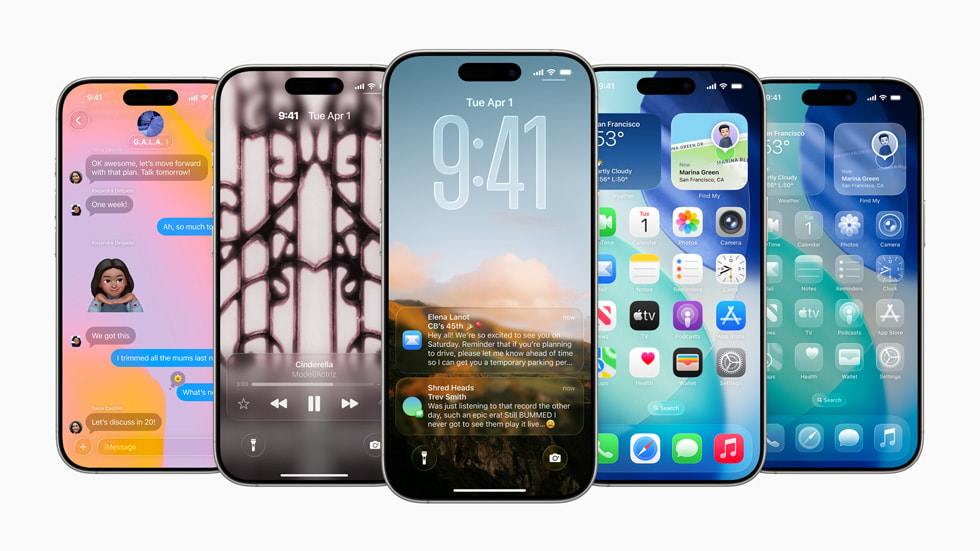
iOS 26’s Liquid Glass interface makes everything more transparent, and you can also bring this effect to your Home screen icons by making them clear. The Clear Icon Look provides a dramatic visual change to the icons on your iPhone or iPad, removing them from the usual bright neon colors and transforming them into translucent outlines.
Besides the fact that many users like the look of clear icons, one of the biggest benefits of using clear icons on your iPhone or iPad’s home screen is that they remove the color of bright red notification badges that show digital indicators of things like missed calls, voicemails, unread messages, app updates, number of unread emails, notifications, and alerts.
If you want to radically transform the look of your iPhone or iPad home screen by making the icons clear, read on and this neat customization will be enabled on your device in no time.
How to get clear icons and widgets on iPhone and iPad with iOS 26 / ipadOS 26
You must have iOS 26 / iPadOS 26 or newer on your iPhone or iPad to have this customization option:
- Go to the Home screen of your iPhone or iPad
- Long-press on the Home screen until the icons start to shake, then tap “Edit” in the top corner, then tap “Personalize.”
- Choose “Clear” from the bottom icon options, optionally choose Light, Dark, or Auto to further adjust the Light look, or have it automatically adjust based on your system’s overall theme (Light/Dark/Auto).
The Clear effect is immediate and significant, there is no doubt that it is activated.
As you can see, it completely removes all the color and brightness of the red notification icons and badges on each icon, giving a smoother, simplified and less distracting look.
You can also revert to the default appearance at any time, but you may find that after using Clear for a while, the default appearance now looks quite garish and jarring:
If you’re one of the iPhone users who isn’t a big fan of Liquid Glass, you probably won’t like the Clear look much either, and you might appreciate some tips for shrinking Liquid Glass and improving its readability on your iPhone or iPad. For me personally, at first I didn’t like Liquid Glass, but it really grew with iOS 26 on iPhone, although I can’t say the same for macOS Tahoe.
What do you think of the clean look of icons and widgets on the iPhone and iPad home screen? Do you like the Clear look that pairs well with Liquid Glass, or do you prefer the old default styles, dark icon style, or color tinted icon appearance? Share your thoughts in the comments!


